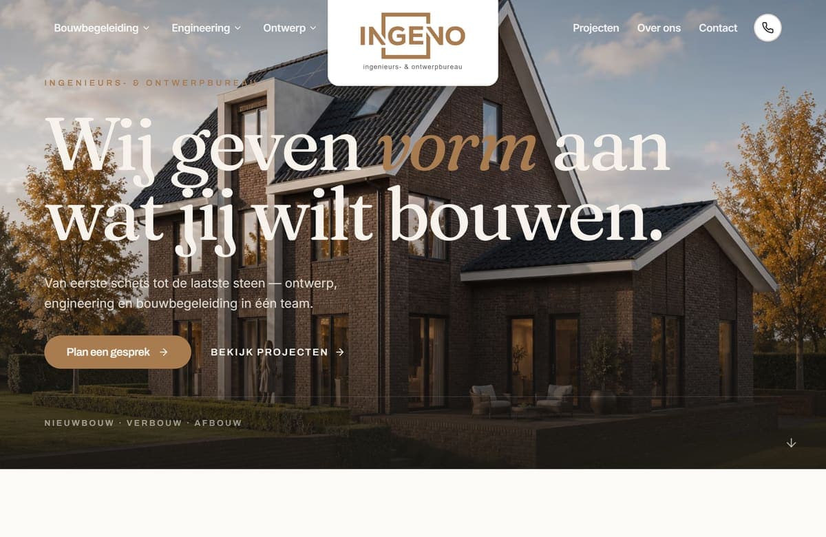
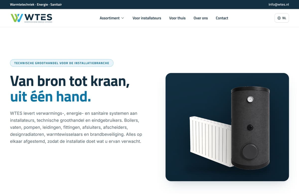
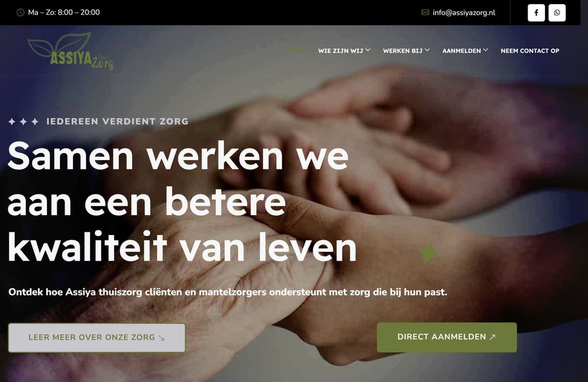
Websites · Branding & logo
Ventilation specialist for maintenance, cleaning, replacement and balancing of mechanical ventilation and heat recovery units. We refined the logo, set up the brand identity and built the website that brings in customers and callback requests.
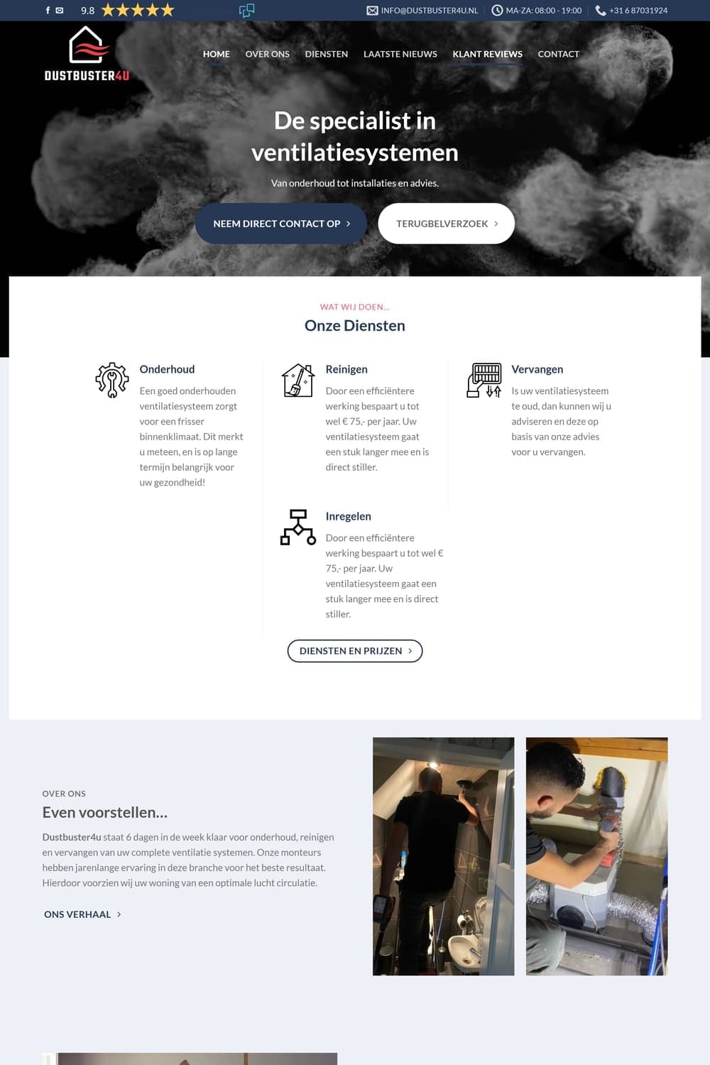
Hover the image to scroll through the page
DustBuster4U already had a first version of the logo: a house with air flowing through it. The idea was good, but the gradients and the lettering did not work everywhere. Embroidered small on a polo shirt the gradients blurred, and there was no white variant for dark backgrounds. There was also no website showing what the technicians do. People who want their ventilation cleaned want to know in advance what it delivers, what it costs and whether others are happy. Those questions had to be answered online, with one clear step towards contact.
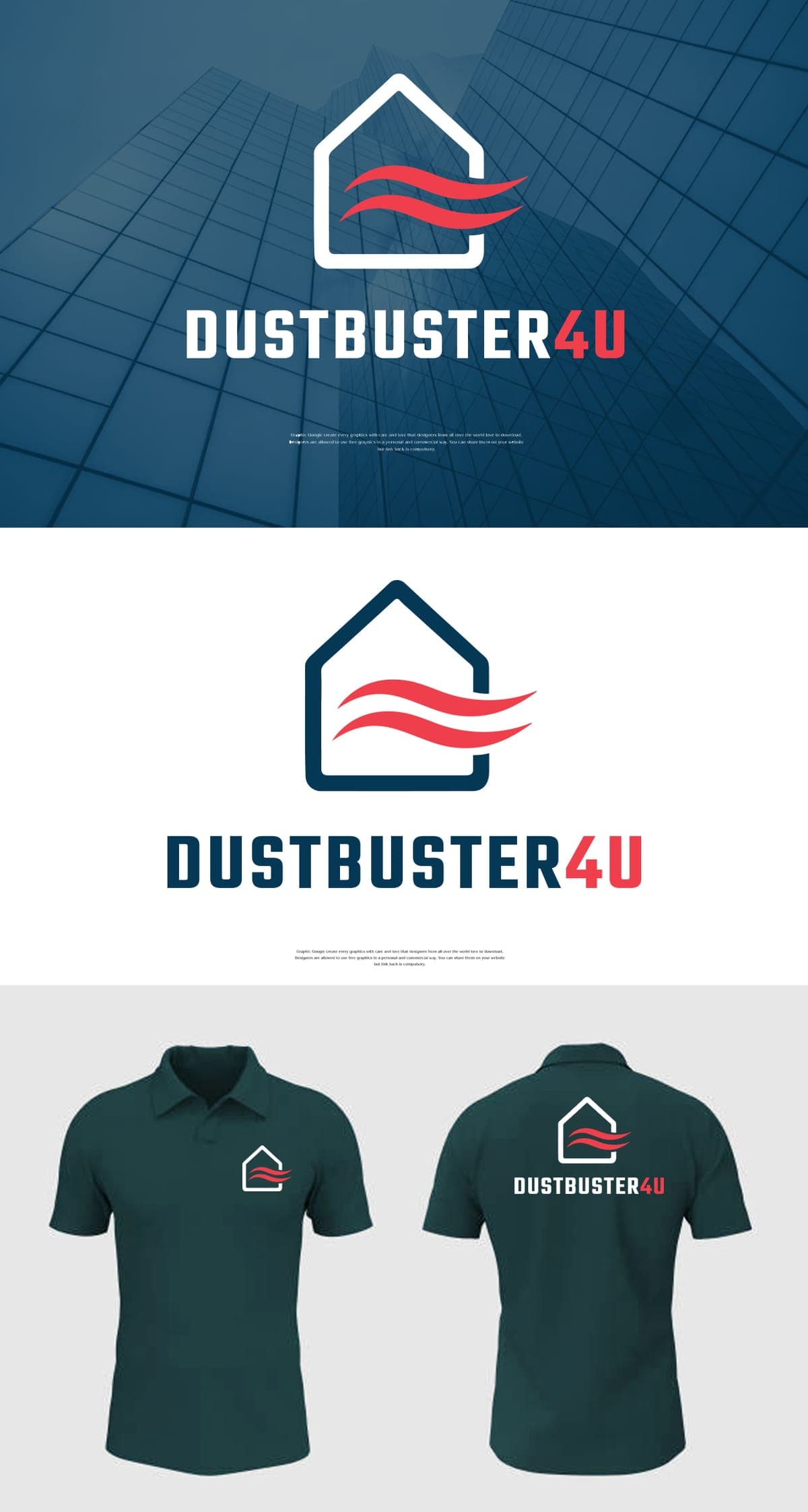
We kept the strong idea of the logo and made it cleaner: the waves were given a single flat red, so they stay sharp even small and embroidered, and the name is set in a compact, sturdy typeface with '4U' in the same red. There is a dark blue and a white version, applied to a facade and company polo shirts. We carried that identity through to a WordPress website with a dark hero full of smoke and air, the four services (maintenance, cleaning, replacement and balancing) with prices, before-and-after photos of real jobs and the benefits for health, energy bills and air quality. Feedback Company reviews appear both at the top and halfway down the page, and a callback form returns in the hero, at the bottom of the page and in the footer. FAQs and a blog help with findability.
Free consultation
Tell us what you want to achieve in a free intake. You will get an honest answer within 24 hours.